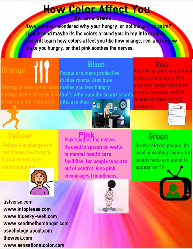
In spectra, for a project we made an infographic. An infographic uses pictures and words to tell you about a topic. My topic was how do colors affect you, I picked this topic because I thought it would be cool to find out what colors do to you. Have you ever wondered why most restaurants use colors like orange, yellow, and red? Well you find in my infographic below.
After I finished my project I thought that I did pretty well, as you can see it's very colorful (because of the topic.) The benefits of this project, are that I have an idea of what colors I could paint my room, etc. If I could make my project better I would space my info out more. If I could do my project over again I would create it on a different site. I hope you enjoy my infographic!
After I finished my project I thought that I did pretty well, as you can see it's very colorful (because of the topic.) The benefits of this project, are that I have an idea of what colors I could paint my room, etc. If I could make my project better I would space my info out more. If I could do my project over again I would create it on a different site. I hope you enjoy my infographic!
 RSS Feed
